The tactical usage of a good typeface
An alternate title to this post is "Why are the Resident Evil 9 title screens so bad, when they're just doing the Control thing (that is so good)?" But that title is too long and too mean.
Really, though, why does Remedy get all the flowers for their title screens and style, but I look at the chapter titles of Resident Evil 9 and recoil?
It's not about the size of your font, it's how you use it.
Titles are more than text
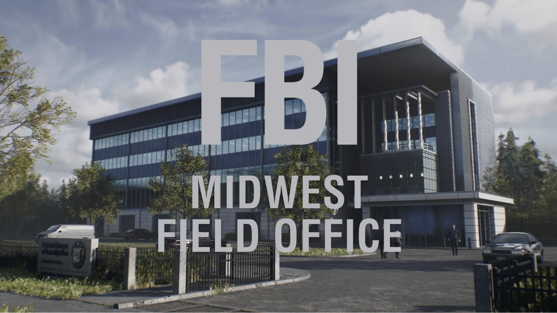
When you begin Resident Evil 9: Requiem, you first see an establishing shot of the FBI Midwest Field Office. You know this because you're shown a nondescript building that honestly reeks of federal construction, and then a GIANT title pops up informing you that, as you expected, this is the FBI Midwest Field Office.

Pretty simple and, as some people on the internet have pointed out, mostly like inspired by the type treatments in Control and Alan Wake 2, both in their relative size on screen and the accompanying sound effect sting. And, while I agree there is probably some inspiration here, there's also some missed marks.
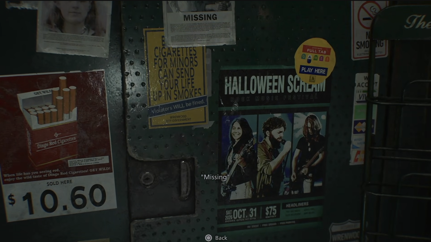
First, let's ignore the typeface itself for now; let's talk color. The type in the opening establishing title, as well as future titles in Resident Evil 9 are this off-white color that struggles to stand out. The background image is knocked back in brightness, even though it seems to be a sunny day for the FBI. The off-white color of the title is blending with the background image. The I's both in "FBI" and "Field" are fading into oblivion; "FBI" into the clouds, "Field" into the fence post.
If we swap the gray for a full white title, the text is more readable, but it's still not popping off the screen like we'd expect. Why? There's just too much going on.
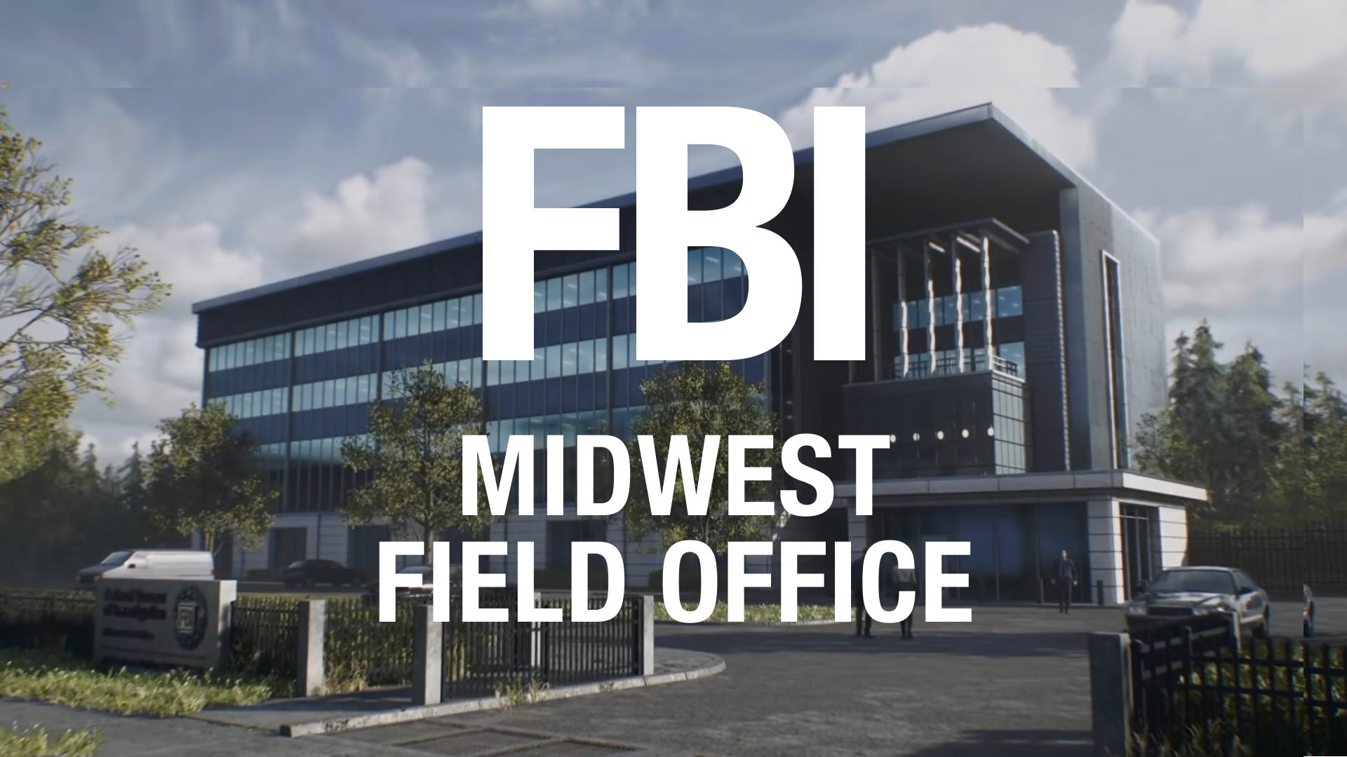
The title is long and tells us more information than we probably need to know. All text on screen is not presented equally; based on the hierarchy of the titles, "FBI" is more important than "Midwest Field Office," but the team still thought it important to ground the game in the Midwest. It's not wordy per se, but it's odd to have two different levels of hierarchy here. I personally think that's less of a title problem and more of a failing of this establishing shot. There's nothing in this opening montage that distinguishes this building from being outside Chicago, Portland, or Boston. The titles need to fill in two gaps for the player: what is this building, and where is it?
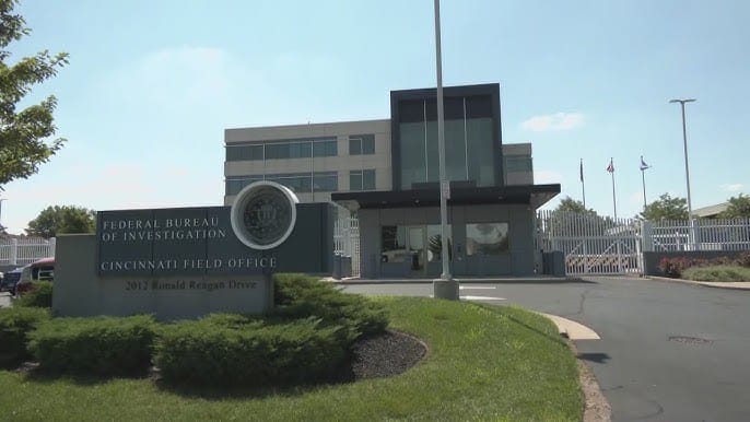
The other issue here is how boring the opening shot is and where the team decided to put the title. If you were to imagine this building as a place that truly existed, we could slide the camera a little to the left and keep the giant concrete sign that says "Federal Bureau of Investigation" in the shot where it would be readable. The text beneath it is hard to read, but one imagines it says "Midwest Field Office."
The purpose of the opening title in Resident Evil 9 is to tell you where you are, but say very little about the location, how we're supposed to feel about the organization, or its relation to our characters. Which makes sense! Within the opening cutscene, this location doesn't exist. You meet Grace's boss, Grace, see Grace's desk, learn about her trauma, and then boom, off to Not-Chicago you go.
Does the establishing title need to exist in Resident Evil Requiem? No, probably not. But, let's say it does. Let's say, you open on the exact same establishing shot (ignoring my lovely direction to use the diegetic sign) and need to put this title in somewhere. Show the building, show the suits walking through the office, introduce Grace as a character, then, when she has left her cluttered desk overflowing with unfiled reports, hit us with the title (with equal hierarchy so you read it like a sentence and in a stark white).
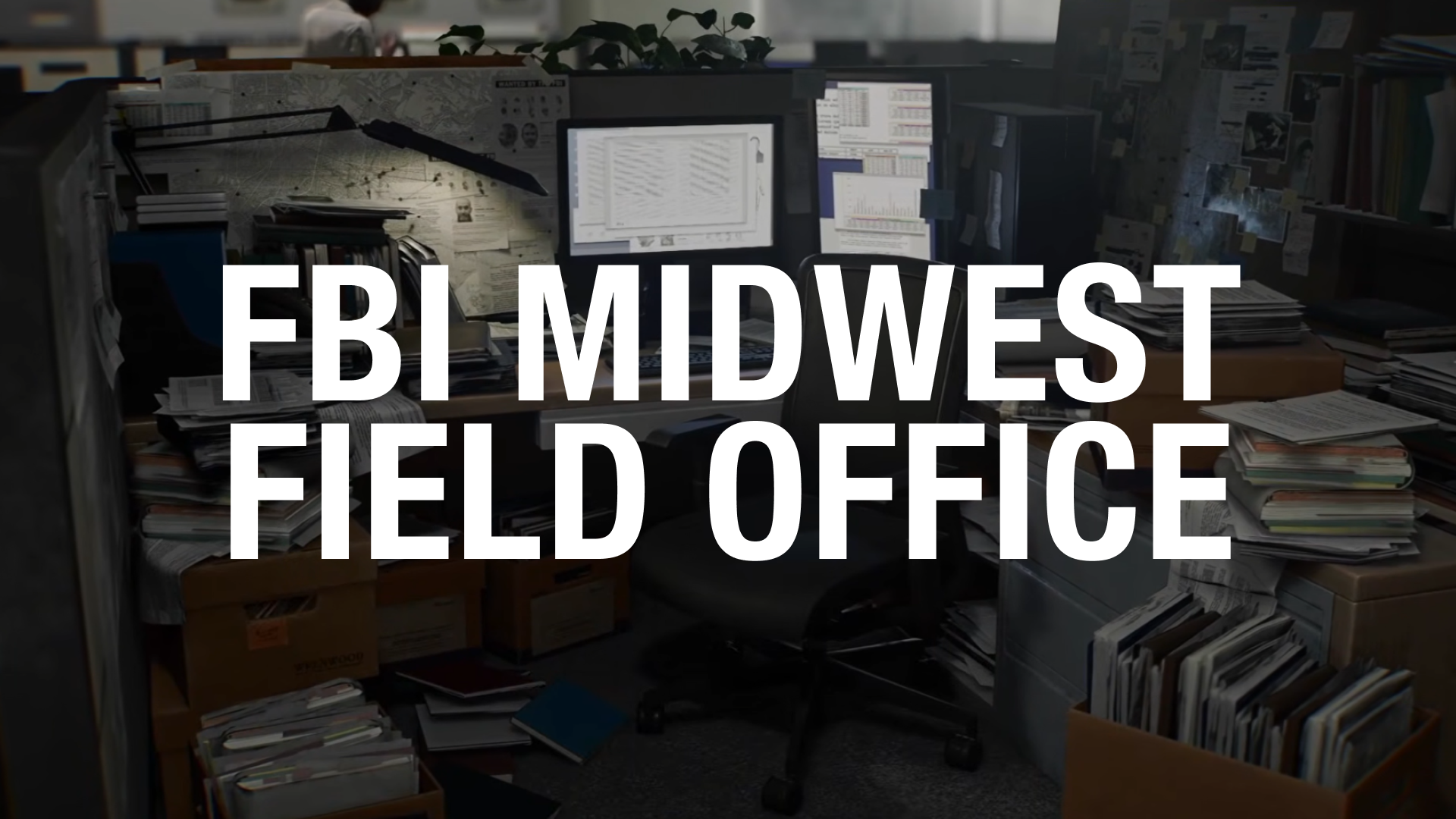
This title location says something beyond what the words say. This is the FBI Midwest Field Office, yes. But it is a cluttered heap of bureaucracy that is burying Grace, just like the trauma she is trying to face. More than the look of Control's titles, this is how Remedy would pull this title off. Except, it's not. This isn't how Remedy does it at all. Let me explain.
How Control establishes its location
First—and I might say this is valid for Resident Evil 9 as well—it doesn't matter where Control takes place. It's a city. Probably New York City, but the location on a map isn't nearly as important as the location as a place: the Federal Bureau of Control's headquarters, The Oldest House. The first text a player sees in Control (minus the subtitles) is in the lobby of the Bureau's headquarters.
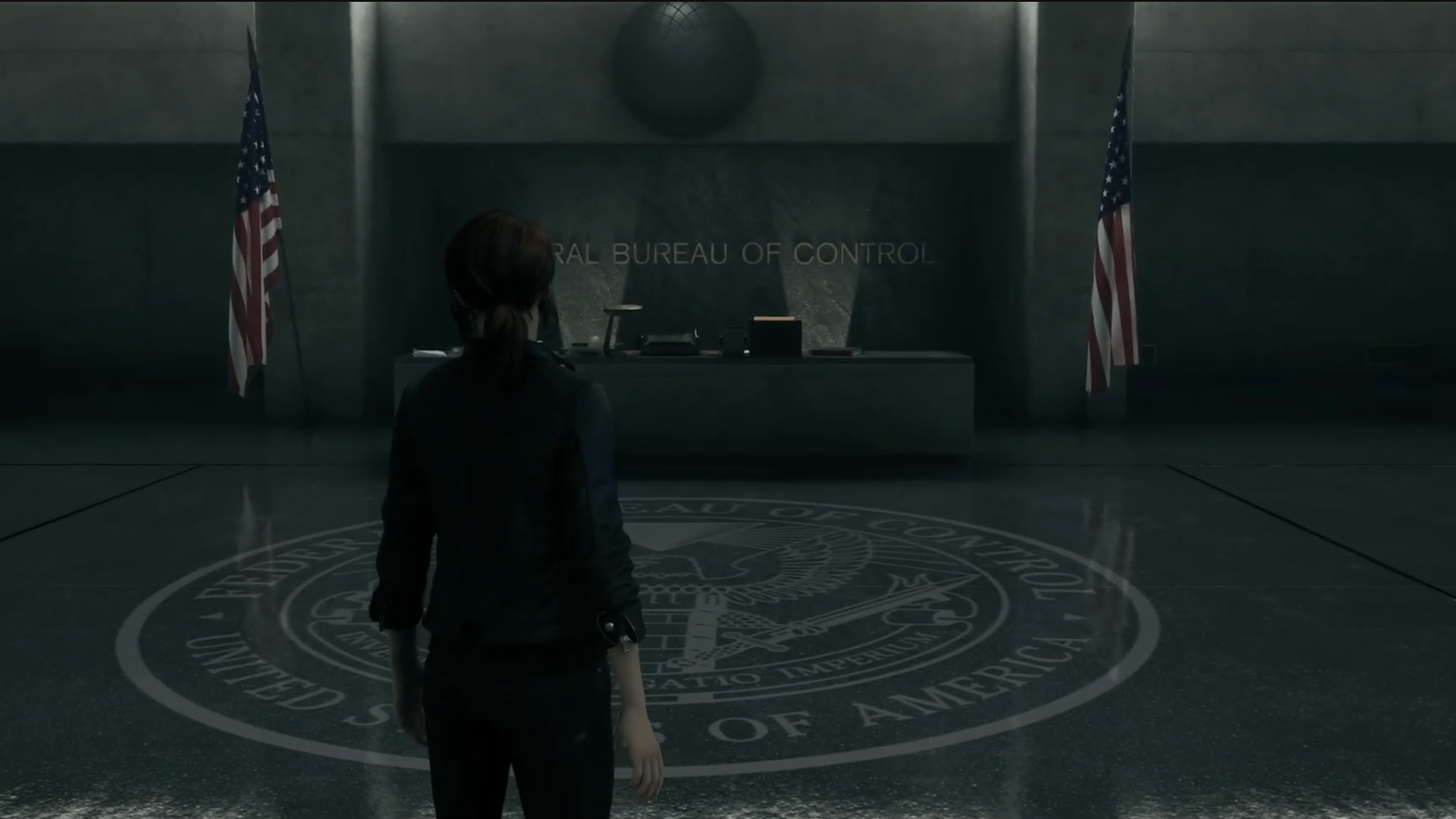
The intro cutscene flies through a dingy nigh-time scene in a nondescript (probably New York City) city, then pans over—upside down, mind you!—the name of the building's tenant: Federal Bureau of Control. In roughly the same amount of time as Resident Evil's establishing shot, we gain the same information from Control without the use of a single title splash.
A few minutes later, after you're able to explore the opening level, see the faces in portraits, and navigate an oddly empty bureaucratic building, you chat with a weird janitor and get your first quest with an odd title: Welcome to the Oldest House. Again though, this quest text is not the establishing title card text Control is known for. This fluorescent yellow text is the actual first UI text you see on screen.
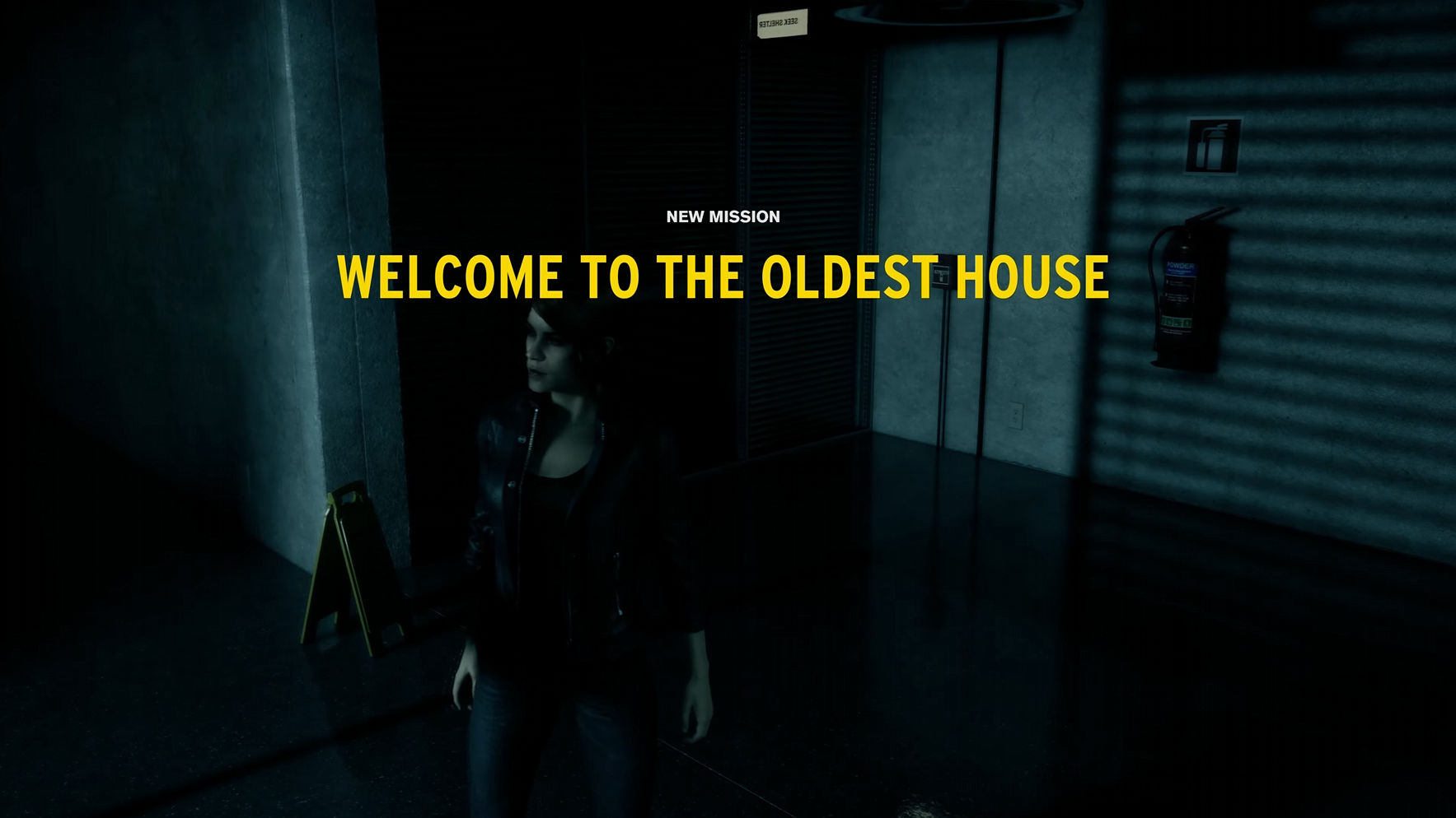
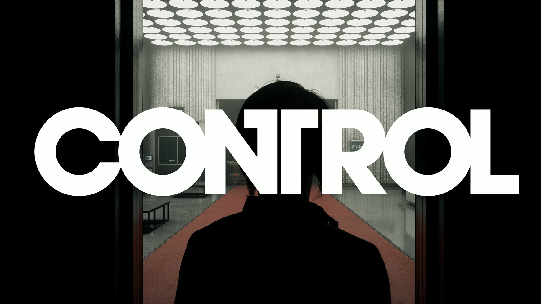
The first actual appearance of the Control-style title splash is with the game's title reveal as Jesse exits the elevator into the Executive level to find the Director and, specifically after the game's entire TV show style opening credits. The title is matched to an elevator door opening and the ding of an elevator. No dramatic sound effect is playing yet, but the Oldest House is working overtime here to splash the title on a stark gray, white, and red background.
When I'm reflecting on the big title use in a game like Resident Evil, I'm looking at a lot of stuff; it's the placement of the title, it's the restraint of when its used, what it's trying to tell the player, and, yes, does it look cool. The first time the title is used in Control—and the only time it isn't used to describe a location—is more restrained than it appears.
The text is the largest it will ever be, but it took around 20 minutes to appear, and it occurs directly after the sickest opening credits I've seen in a long damn time. "Control" being splashed on the screen in this overwhelming kind of way, separate from the yellow quest text we saw first, is oppressive; it's an intention jump scare you cannot avoid.
The title placement in Control is also thematic; the doors open up from black void onto a over-lit office depicted in three colors: white, gray, and red. The title font splits Jesse's head in half, as if the notion of control is colliding, but remains separate within her head (which it is).
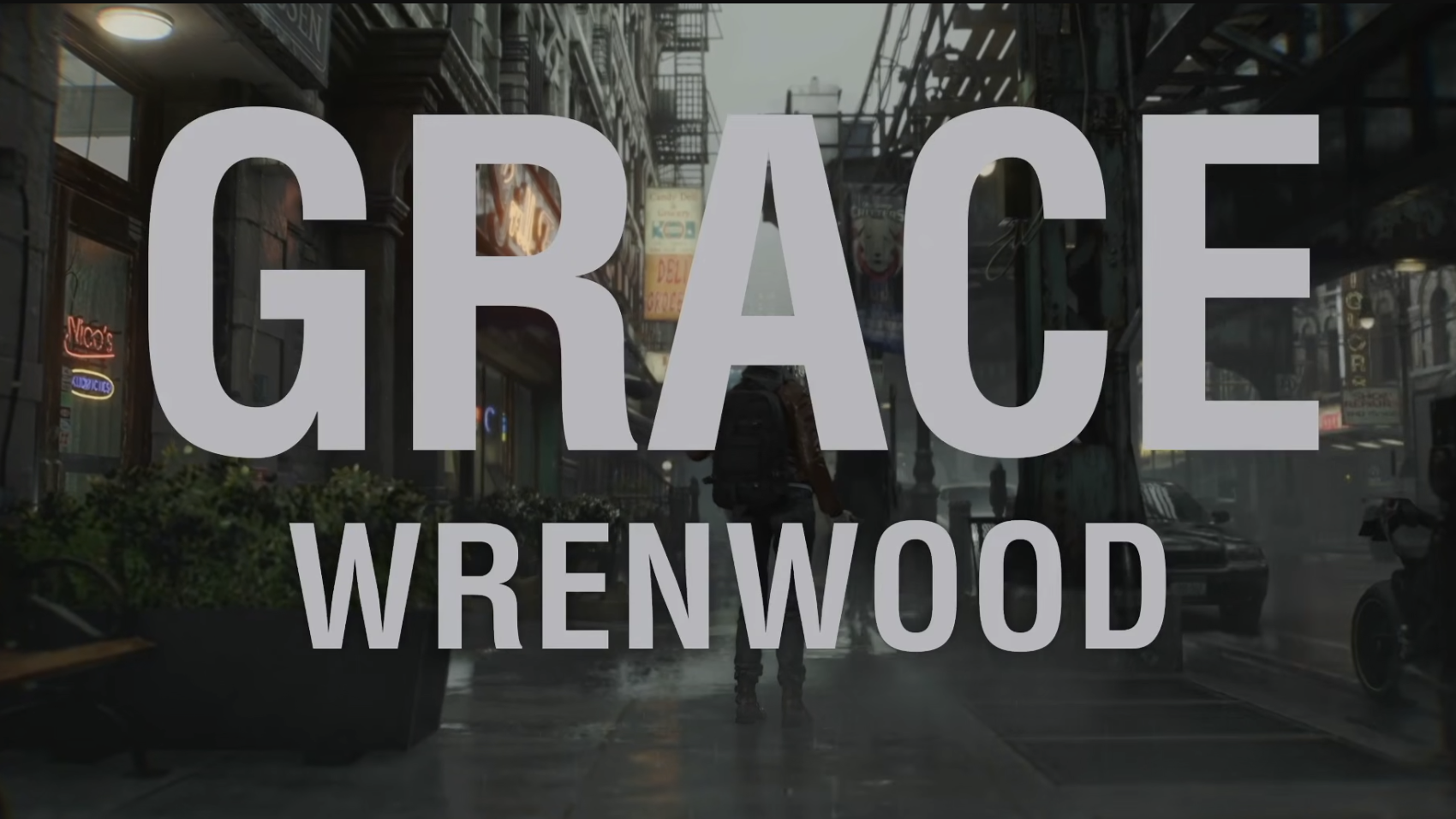
I want to return to something I mentioned earlier: part of the charm of Control's titles are their readability and their singular purpose. A title in Control tells you one thing: where you are. A title in Resident Evil Requiem, tells you two things...usually: who you are, and where you are. Except the first title, remember? That one tells you the organization and a nondescript location for said office. But, FBI Midwest Field Office reads as a sentence, so you'd be remiss for thinking you are playing as Grace Wrenwood or Leon Raccoon City.
If you've made it 1,500 words into this blog post about fonts, you're probably looking for two things. First, I actually don't think one game does the big titles thing better than the other.
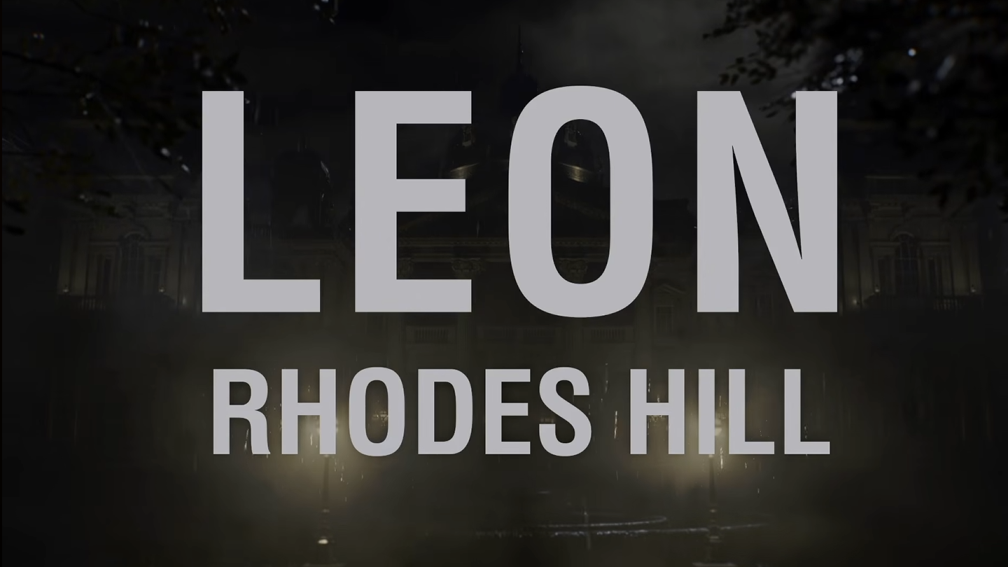
Don't get me wrong, walking into an all black room bathed in this haunting read light and a sound sting drops a stark white "DEAD LETTERS" on screen is so much cooler than introducing Leon Raccoon City. No contest.
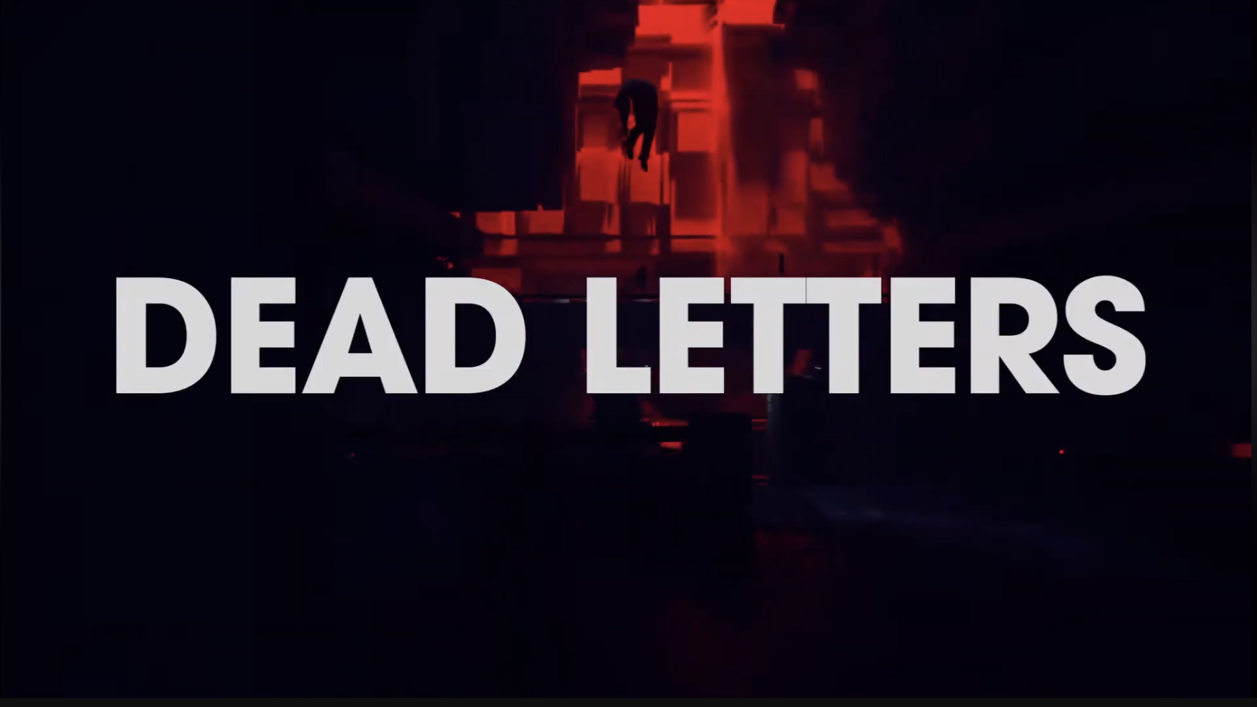
But, I want to be really clear: there's no copying or whatever the latest internet ragebait is claiming about this. "Big Title" is all over the place these days. It's in movie titles, video games, and book covers. Subtlety is out and the art of picking a kickass font is in. Resident Evil is using their big title cards completely differently than Control is, even though similarities are there on the surface.
Control uses massive text on the screen to tell you a position in the world. They're loosely chapter markers tied to your in-game location, but not necessarily tied to progress. The titles also tell you something about the world: crossing thresholds is dangerous. Most obvious when you cross the Firebreak for the first time—a literal void spanning a limitless chasm—each time a location title pops up on screen, all other interface disappears. Even in the middle of a firefight, you lose your aiming reticle, positioning information, and ammo counter. By crossing a threshold to a new place in the Oldest House, you are going in blind, the letters above the door the only thing preparing you for what's next.
Resident Evil 9 is leaning more into police procedurals or tropes of the zombie genre. These titles are positioning you as a person in a place. Titles function as chapter markers in a book, telling the player that we've moved on from Leon in Raccoon City to Grace in Wrenhaven. Do I think think that that transition is usually obvious with the default state of each play-style being third- and first-person, respectively? Yes, but sometimes gamers need an extra nudge.
The second thing you probably want to know is the actual typefaces.
Okay fine, let's talk about typefaces
Resident Evil 9: Requiem uses a modified version of Helvetica Neue Condensed.
Control uses a version of ITC Avant Garde Gothic with tighter kerning (the letters are closer together; look at the two Ts in Dead Letters above to see what I mean).
Both games use a few typefaces throughout the game. Resident Evil uses Helvetica Neue in its titles, but the title font of Requiem, as well as most in-game text, is a typewriter-style font. Control uses ITC Avant Garde, but its in-game documents and UI elements use different faces as well.
I haven't gone too deep into Resident Evil 9 (this entire post was inspired after watching three minutes of a Stephen Hilger's playthrough on Into the Aether...and then stopping to write this), but if there's one more fun font fact I can leave you with about Control, it's not even about big title, it's about little text.
Interstate, the typeface, not the road
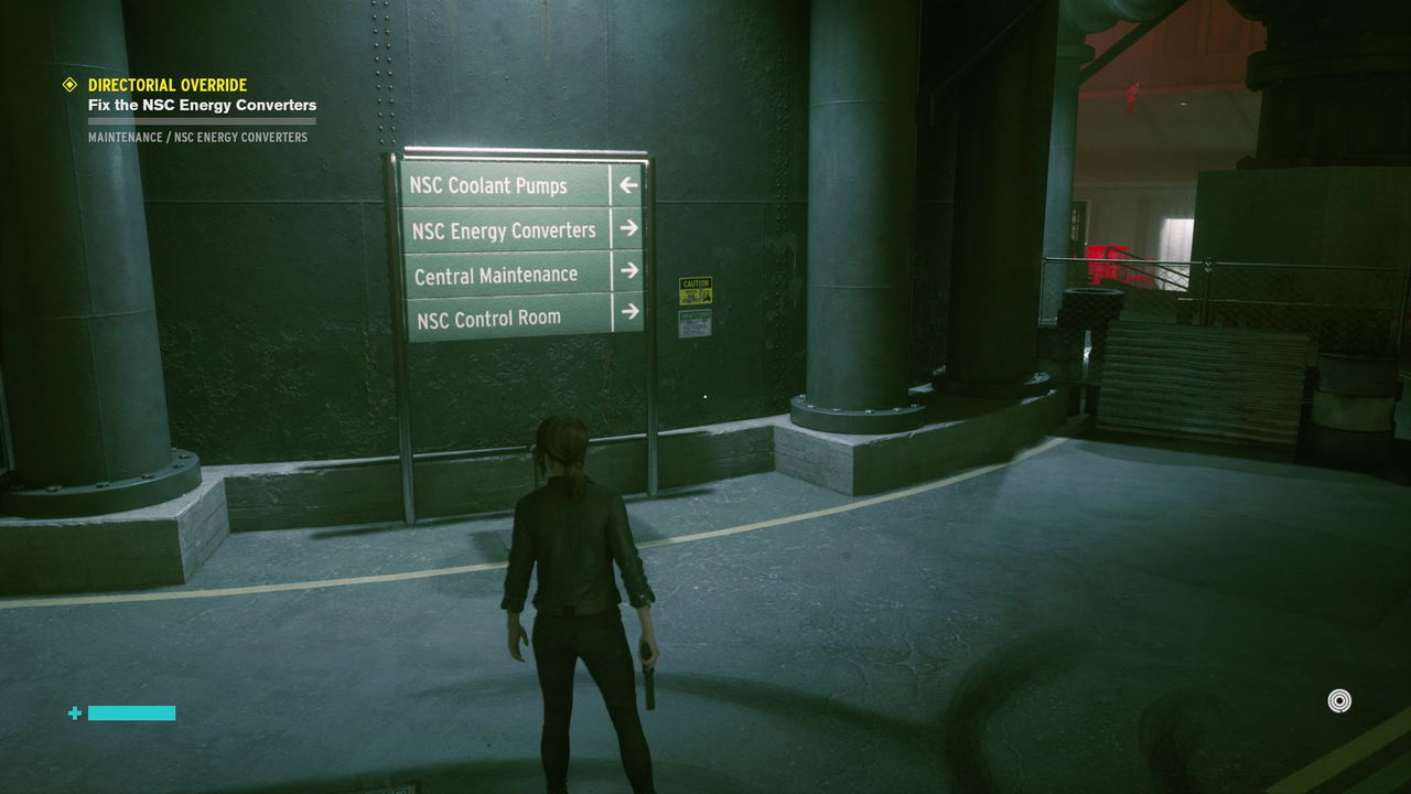
Remember that first piece of UI text we see in Control, "Welcome to the Oldest House?" The quest title UI uses Interstate, a font that is inspired by Highway Gothic or FHWA Series. FHWA Series was designed in the late 1940s for the Federal Highway Administration and is the typeface used on all federal highway signage. As an American, this is most likely the typeface you interact with the most in your daily life, including street signs, stop signs, and interstate exit signage.
Control uses Interstate to direct you through the levels. The game is lacking a "good" map, but pathfinding is placed in the Oldest House at main junctions using the same font and color scheme as American interstate highways. That same font is also used in the more metaphorical pathfinding sense as well: the on-screen quest log. Are you lost? Look for the signage set in Highway Gothic! Do you not know what to do next? Look for the signage set in Highway Gothic!
I love so much about Control (and can't wait to see where Resident Evil 9 goes), but what sets these two games apart (at least when it comes to fonts) is the level of detail Remedy put into choosing the right typefaces for the right purposes. Every typeface used in Control is broadly period accurate, whether that's Interstate being based on 1940s federal guidelines, or ITC Avant Garde hailing from the logo of Avant Garde magazine in the 1960s (no surprise it looks so good blown up, huh).
I'm sure that the art team working on Resident Evil 9 had thoughts about the fonts they used—many of the letters are modified when you overlap them—so I don't want to characterize the work they did as easy. But, I do think their choices (or maybe just their treatments) leave a lot to be desired. Helvetica Neue, even in its condensed form, is relatively popular. So much so that the default font in many word processors is Arial, a font so similar you probably think its Helvetica. Helvetica Neue makes these otherwise monolithic chapter cards feel generic, even when they're trying to be stylish.
There are a ton of ways you can glitz up a relatively generic looking font, especially in pre-rendered cut scenes. I'd like to think matching the title appearance with an in-game motion (Leon stomps in a puddle), then flipping the color to a spooky red when the camera shot changes could be one way of doing it.
And really, when we're comparing anything to Control or Alan Wake's font work, I think that's what we're really talking about: panache. Control's usage of period- and purpose-correct fonts in its titles and in-game text isn't easy, but it stands out in a way that Helvetica Neue never could. Especially in 2026.