Power Made Visible
A few years back, Mike Monteiro, a UX Designer and man-about-the-convention-speaking-circuit, put on a barnburner of a talk titled “How Designers Destroyed the World.” It’s a talk (and now a book) about the ethics of design and how, even with the best intentions, designers are slowly, catastrophically destroying everything around them. In his talk, he focuses on UI decisions for Facebook privacy settings, but, if you’ve ever tried to take a nap on a public park bench, you’ve experienced the power of design.
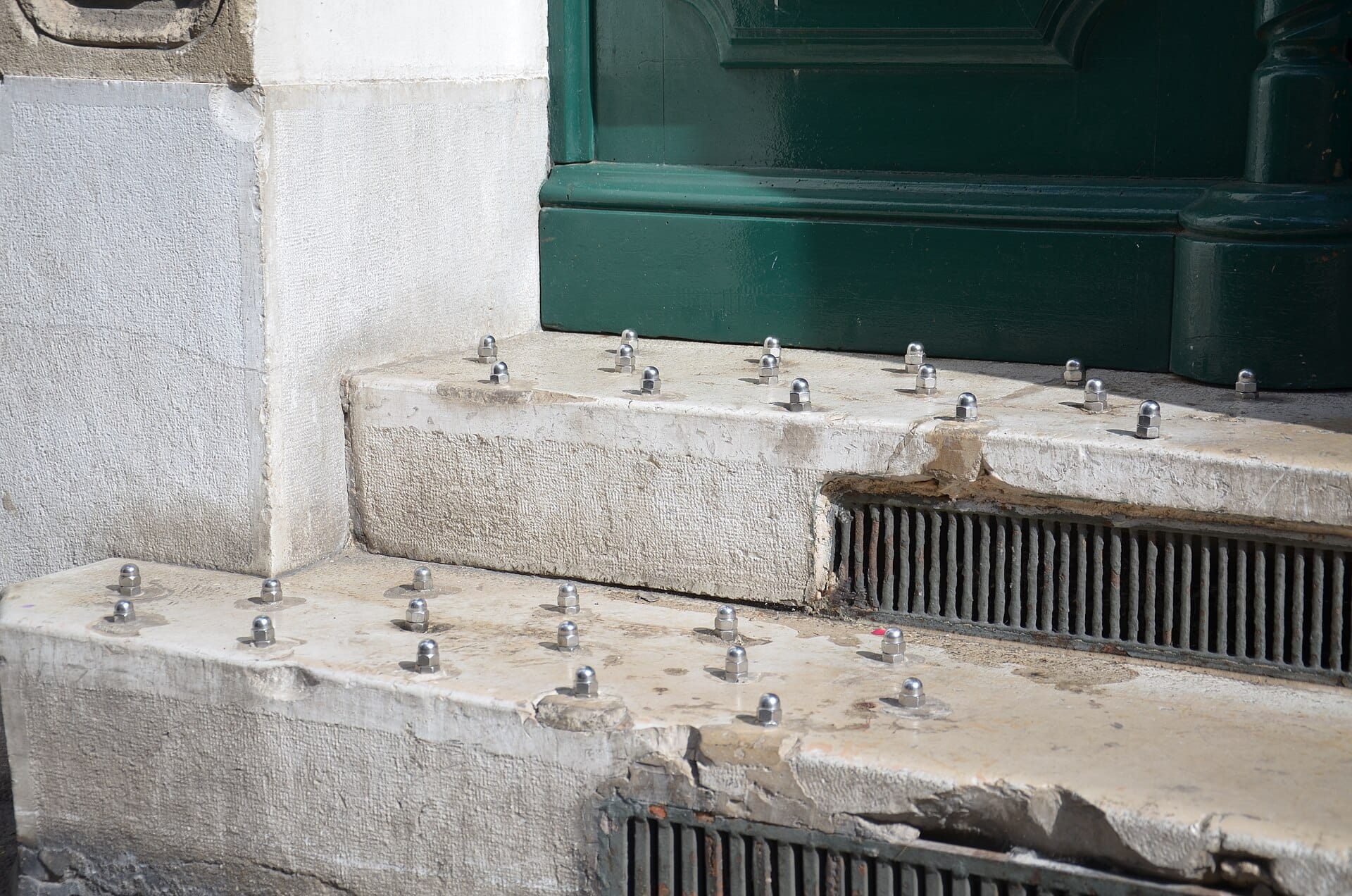
The world—both physical and digital—is designed and it is designed for a reason. Design is, at its most basic, a choice. As designers, we like to think of ourselves, typically, as altruistic: we’re helping the “user” complete an action. But, every pixel, every button, every piece of information architecture is another slice of everyone’s lived experience that is often painstakingly (or not) designed to get you to do something. Your house was designed, your desk was designed, your sidewalks, billboards, car handles, door handles, the flow of UI screens for unsubscribing from Amazon Prime. It’s all designed for someone, but most likely it’s designed with a motive.
I don’t want to misrepresent things too much; there are plenty of designed things in our world meant to bring joy, happiness, or ease, including many of the video games we play. There are plenty of delightful (oh how the designer loves to surprise and delight) quirks in parks or architecture. But, as Victor Papanek states in the opening line of his 1971 book “Design for the Real World:”
There are professions more harmful than industrial design, but only a very few of them.
And, if Victor’s point wasn’t quite made, he doubles down a few paragraphs later:
As long as design concerns itself with confecting trivial “toys for adults,” killing machines with gleaming tail fins, and “sexed-up” shrouds for typewriters, toasters, telephones, and computers, it has lost all reason to exist.
Papanek spends the bulk of his book explaining how design is more than the decorative. Especially in the modern era—but always present throughout human history—design is existentially in need of an ethical lens. Sure, that door that doesn’t obviously signal how to open it isn’t a huge ethical quandary, but cars designed for style over safety, or concrete buildings that remove surfaces for resting on are physical manifestations of unethical design exerting real world power on humans.
Your normal day is filled with moments shaped by the design decisions of others and, while many of them are unethical, few burgeon on being truly evil or nefarious. Not in a grand sense anyways. Each design decision reinforces the power of a little fiefdom. What has really stuck with me though, especially as we all navigate what the United States has become in 2026, is design being used as an instrument of unethical, intentional evil.
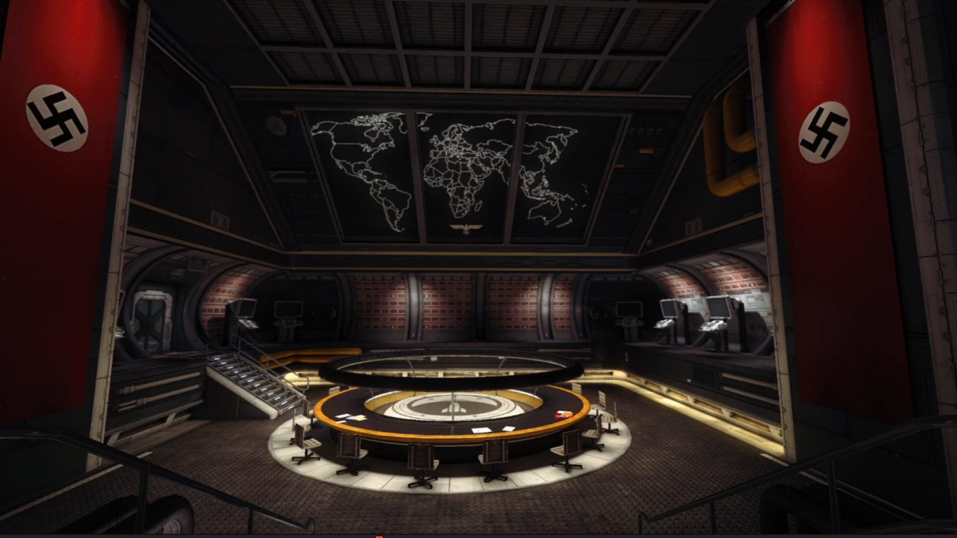
The nefarious use of design is, like unethical design, nothing new. Few regimes understood this relationship between power and design more completely than Nazi Germany. From grand state buildings, to city planning, to the typography of memo letterhead and the uniform code, the Nazis understood the utility of strong design.
There’s a symbiotic relationship between the explicit power of bombs and airplanes and the implied power of a well-designed, cohesive appearance. The Nazis had ideology, yes—a lot of it—but they also had symbols and styles. They were, unfortunately, excellent designers. This is, somewhat, why Wolfenstein feels so believable: the design elements of the Nazis are easily recognizable, even within the context of the 1960s.
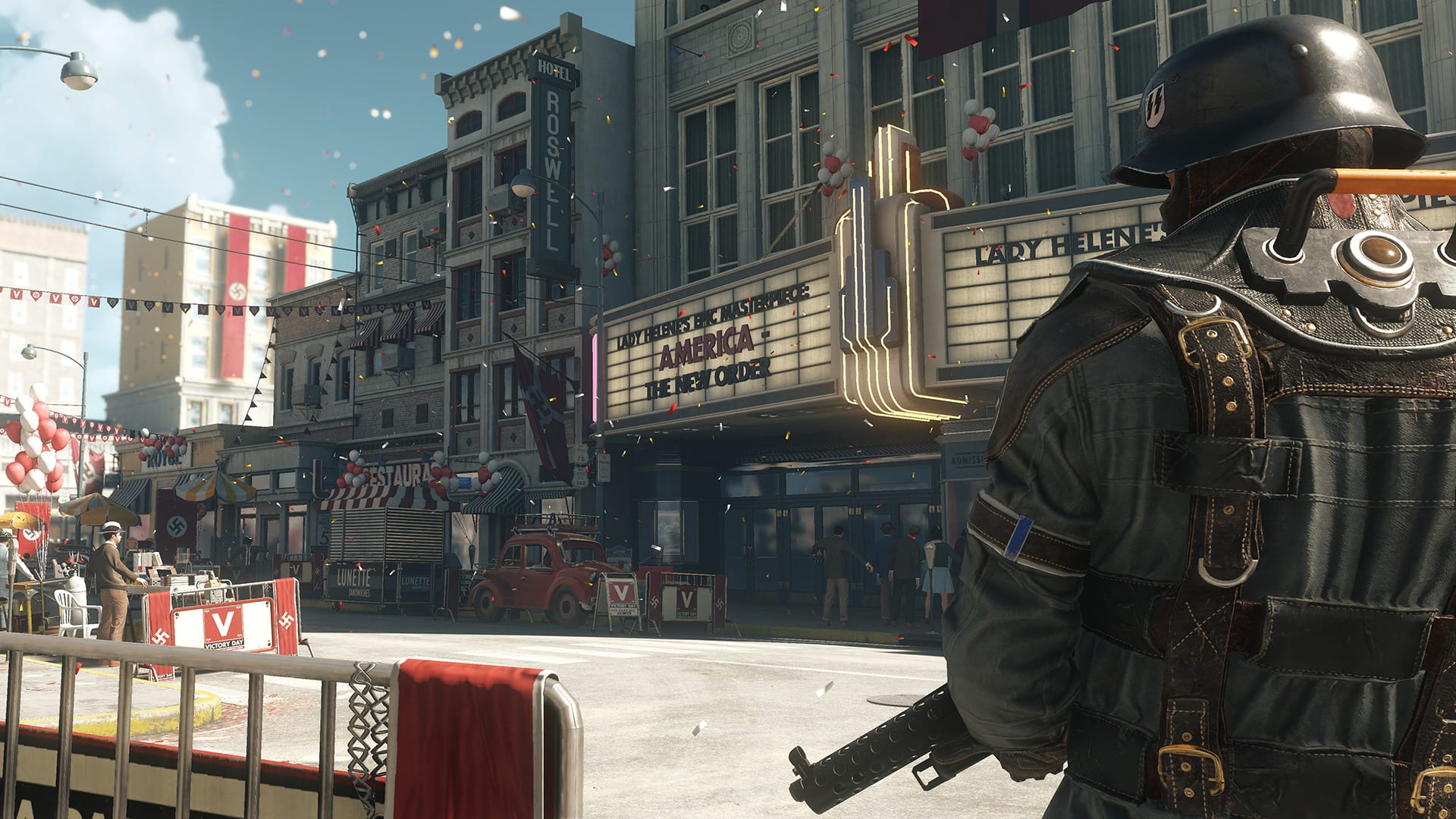
When we think of power, it is easy to conjure images of force. Guns, bombs, airplanes, and tanks are symbols of the force behind the power. These objects are symbols of potential; the last resort of power unacknowledged. On their own, weapons are powerful, but they are not power itself. Power itself is keeping those planes piloted, the tanks crewed, and the guns held.
When power is the function, design gives it form.
One of the most used pieces of the Nazi regime was the memo. As a highly hierarchical group, the Nazis—like many corporate-style organizations—loved a memo. Taken at face value, the memo only has a few component parts:
- Letterhead
- The body of the message
- A name of authority at the bottom
Nazi-era memoranda typically featured official party or state insignia, intentionally standardized typography, and symbols of state authority such as the eagle and swastika. It immediately signified the memo as official, elevating the text within to a decree or commandment of the party, not just from a person within it.
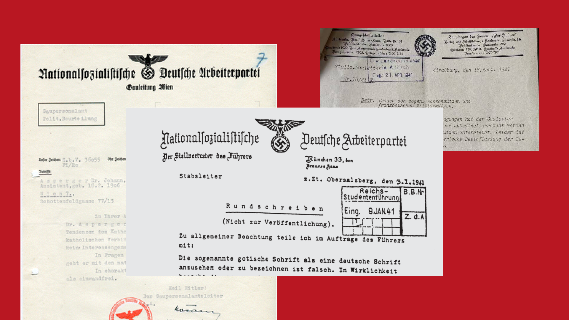
Like many bureaucratic documents, Nazi memoranda often used formal administrative language that obscured individual agency and emphasized procedure; if a name was mentioned it was one of authority. It was often a summary of a thing that was done or an event that occurred. More “for your information” than “let’s discuss this together.” And the whole thing was sealed by a signature.
Put together, the memo becomes a powerful instrument of bureaucracy. It communicates authority, signals that decisions have already been made, and creates distance between decision-makers and those carrying out orders. The memo becomes a designed artifact that reinforces the bureaucracy that is backed by the threat of violence.
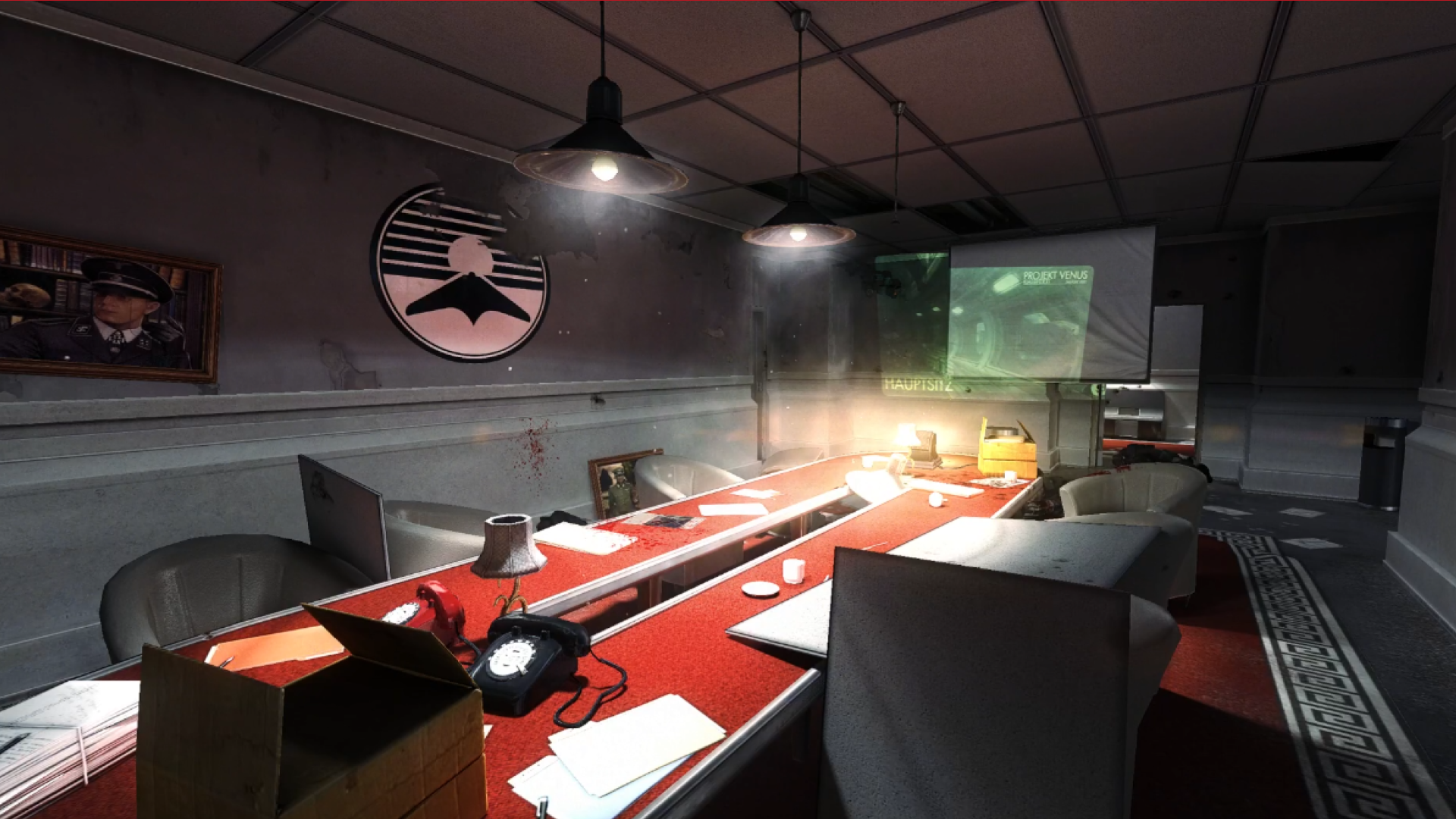
The Nazi state ran on decrees, directives, memoranda, forms, and reports moving continuously through its bureaucracy. Armies were mobilized, cities redesigned, labor organized, and the logistics of the Holocaust administered through an endless flow of paperwork.
It’s likely that the Nazi Party understood the power of cohesive design based on the piles of graphic standards and directives published by the Ministry of Propaganda and the German Labor Front, detailing symbol standards, typography guidance, and requirements for Nazi office letterheads.
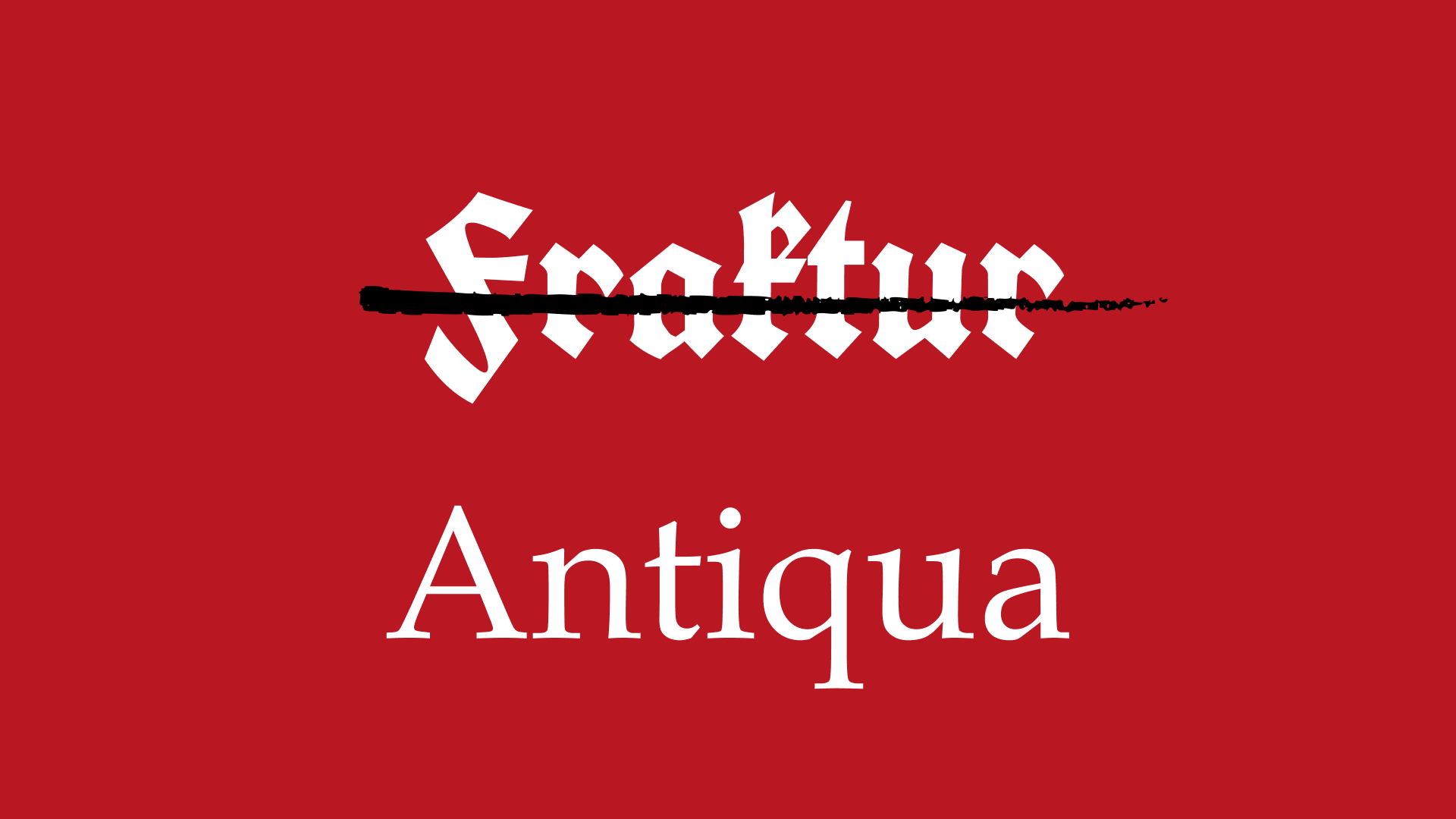
Those graphics guides weren’t just for design cohesion though. The Normal Type Decree of 1941, written by Martin Bormann, Private Secretary to Hitler, falsely claimed that the Fraktur-style typefaces used by Nazis up to that point had Jewish origins and thus banned from usage on any party documents. The typefaces used on official memos were to change overnight because a simple design element was imbued with political and cultural power quietly being reinforced with every memo.
The authority of the memo was supported by the guns and bombs, but it was the boring and formulaic nature of the memo that fueled the Nazis. It made the machinery of oppression and subjugation as boring as the “we’ve updated our privacy policy” emails you receive daily in your inbox. The power remained immense, but the artifact carrying it looked ordinary.
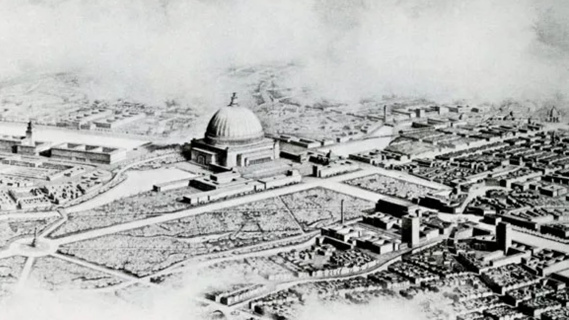
If the memo is an outward manifestation of power at the bureaucratic level, then the Nazis’ fixation on urban-development and city-planning is the manifestation of power at the societal level. Bulldozing homes to pave new streets or make way for supersized party structures was a way to make the mundane authority of the memo written into the daily experience of everyday citizens.
Albert Speer, chief Nazi architect, and many other German architects were charged with reimagining the skylines of Germany, filling the cities with classical structures meant to last as long as the Third Reich: millennia. These buildings and grand boulevards weren’t just structures, they were arguments for German supremacy, the inevitability of their victory, and the cohesion of its people. Every grand monument to the Nazi Party, ministry building, or housing complex was designed to exude control within Germany and strength and power without.
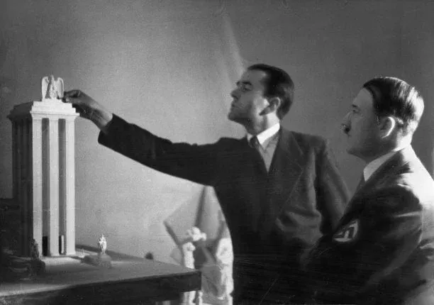
Speer and his contemporaries understood the propagandistic strength of urban development as tools—like the memo—to control the population, shape culture, and incorporate Nazi ideology into the lived environment. In Speer’s memoir, Inside the Third Reich, he talks often of the Germania project and the buildings he designed, saying:
I saw all these buildings with Hitler’s political eyes.
Much of Germania and its designed societal power was never realized, the project ending in the destruction of thousands of homes at the Nazis hands and the destruction of the few state buildings built at the hands of the Russians. But, what if they had succeeded? What would it feel like to live in a world so thoroughly, rigidly designed to control and oppress?
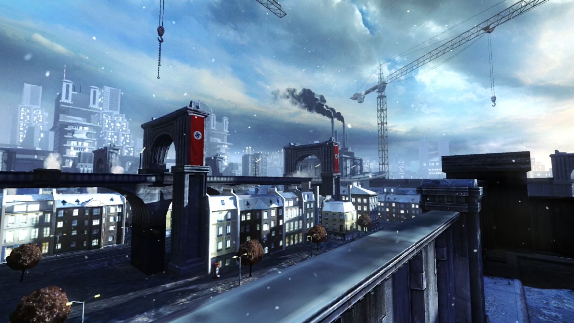
From the memo to the thoroughfare, Wolfenstein: The New Order presents a world where that vision succeeded. The game imagines a society where authoritarian design is no longer aspirational or theoretical but total. Every wall, corridor, sign, and monument was designed to reinforce the power of the regime.
Absolute design is an extension of total war.
If power requires form, then games offer a unique opportunity to examine it. Every building, street, document, and interface can be shaped to reinforce a particular vision of how the world works. The spaces you wander are, by virtue of their creation, intentional. Every in-game memo or concrete texture in Wolfenstein: The New Order was a design decision.
The totality of design’s control in Wolfenstein: The New Order is only truly possible because it is a game. Speer’s Germania would’ve been at the whims of Berlin’s soil conditions, the quality of materials available, and the labor conditions within Germany. But in Wolfenstein, those things don’t matter. Germania exists simply because an artist created it. Wolfenstein’s Third Reich, more than would ever be possible in real life, is a cohesive machine with seemingly absolute power.
If we take away the frenetic gameplay in Wolfenstein: The New Order and linger in the levels and designed spaces, players can feel the oppression. Even in the calm before the gunfights, the built Nazi environments are foreboding.
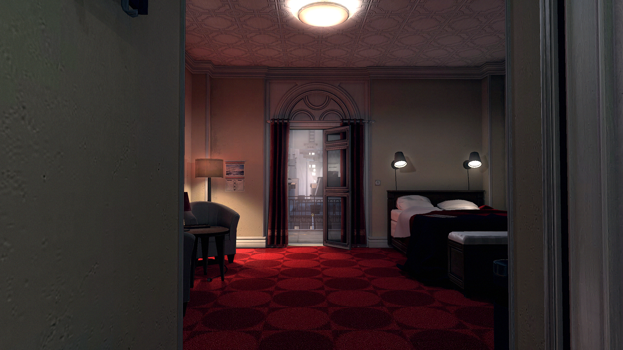
From BJ and Anya’s hotel room in Berlin, the designed manifestations of Nazi power are on full display. The interior of the room is covered with cream wallpaper and rich red carpet, a comfortable arm chair sits in the corner. It is a typical hotel room, complete with a glass paneled door—one of the only ones throughout the entire game—leading out to a balcony. This is, perhaps, the Berlin we expect. Lavish and adorned. Modern. A far-cry from the rigidity and ancient walls of Deathshead’s Compound. The moment you walk out onto the balcony, the entire tenor of Berlin changes. It becomes immediately clear that BJ and Anya may be staying in one of the only remaining old-world buildings in all of Berlin.
The first image BJ and the camera linger on is the jewel of Speer’s Germania: the Volkshalle. Remember though, the Volkshalle was meant to be so much more than just a landmark. Like every monumental buildings proposed by Speer, it is an argument constructed in concrete. It was to be a political building of gargantuan proportions meant to last millennia. A potent symbol of Nazi cultism that loudly proclaims to the world the Third Reich’s permanence, inevitability, and scale.
Searchlights—echoing Speer’s Cathedral of Lights during Nazi Party rallies at Nuremberg—flank the massive dome, along side towering concrete pillars, most windowless spires. Zeppelins perambulate across the sky, hulking gunmetal gray mechs walk the sidewalks, and an armored car surrounded by SS soldiers idles in the hotel parking lot. The moment you leave the security of the hotel, you are assaulted by concrete grayness and countless blood red banners emblazoned with swastikas.
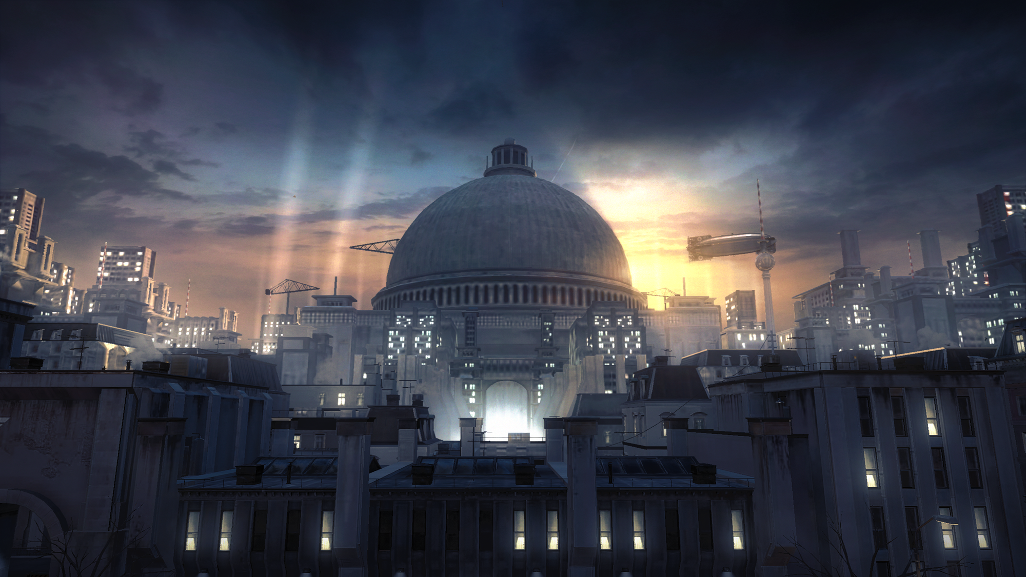
My point isn't that Berlin has been redesigned in steel and concrete. It’s that Nazi power has leapt from the newsreels of our reality and extrapolated to its world-dominating end goal. The ideology woven into every memorandum, decree, and civic redevelopment plan that never was, now towers above the player in concrete, steel, and stone. In the heart of Wolfenstein’s Berlin, Nazi power is absolute.
That power is visible in the architecture and city-planning, with barely a gun visible from your high perch. With Speer’s Germania complete, with Nazi world supremacy cemented in the very earth, massive displays of potential violence are no longer required.
For as sprawling as Berlin appears, it also feels empty. In our world, Speer’s grand plan of Germania was to be completed in 1950; assuming he succeeded, it has been ten years in Wolfenstein’s world for Berlin’s new structures to be populated. The structures though, tiny windows alight, are carrying out their purpose as concrete prison cells for the citizens. All of Berlin is cowed beneath Speer’s Volkshalle, every citizen, by design and the implied force behind it, less than the symbols of state. A grand scheme of oppression written in concrete.
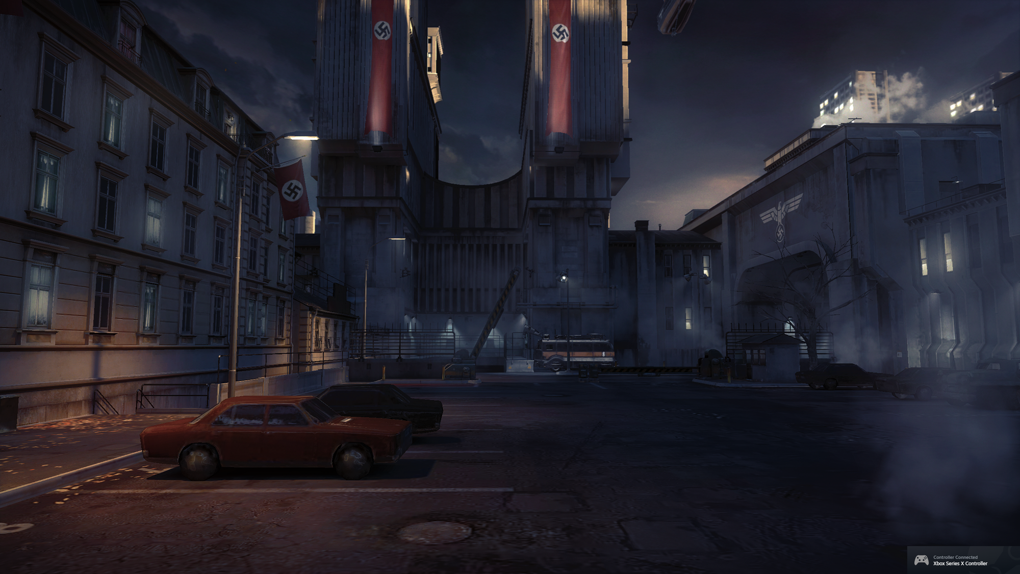
You feel the weight and authoritarian oppression of all that concrete, the planned output of bureaucracy and control, with fewer than ten people visible. The parking lot, except for Anya and the SS soldiers she is trying to distract, is empty of life and filled only with the same black, unmarked sedans. There are no sounds of other guests in the hotel, nor a sign of anyone staying there. A single black, unmarked car drives around a city block forever, the only sign of traffic on the roads. The sidewalks have two more soldiers assaulting the only civilian you see.
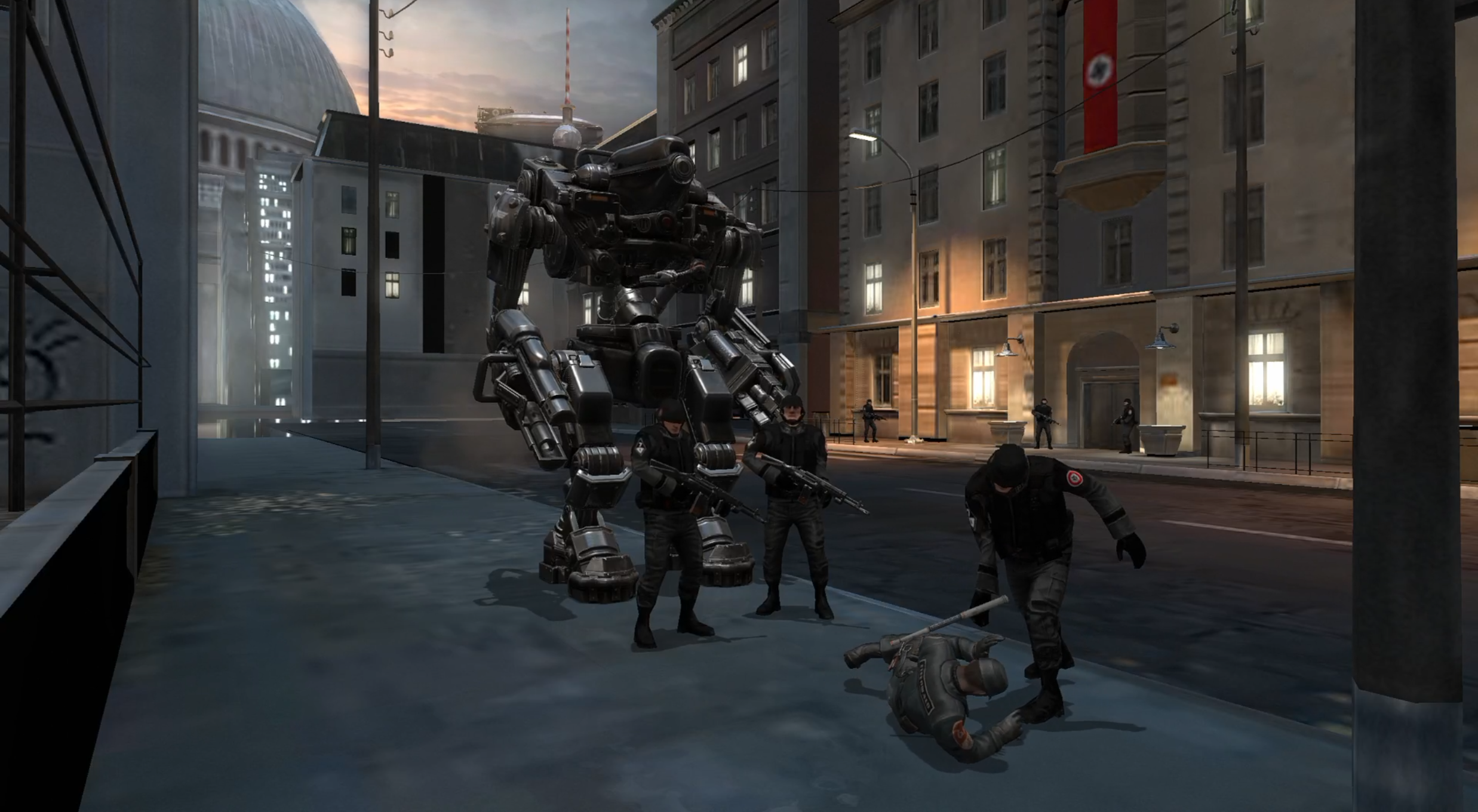
The beautiful bit of game design in this moment though, is that, as BJ, you have run roughshod through three levels of the game already. You’ve most likely come very close to mowing down a triple digit amount of enemies. But here, when exposed to the grand scale of Nazi power, all you have is a knife. The power fantasy crumbles for a moment; long gone was the elation you felt killing the last enemy you fought: two towering, laser-wielding robots. Here, in Berlin, you are meant to feel the same crushing despondency the citizens of the world do. You’re meant to ask the all-important question of Wolfenstein: how do you defeat a foe that was powerful enough to make all they planned a reality?
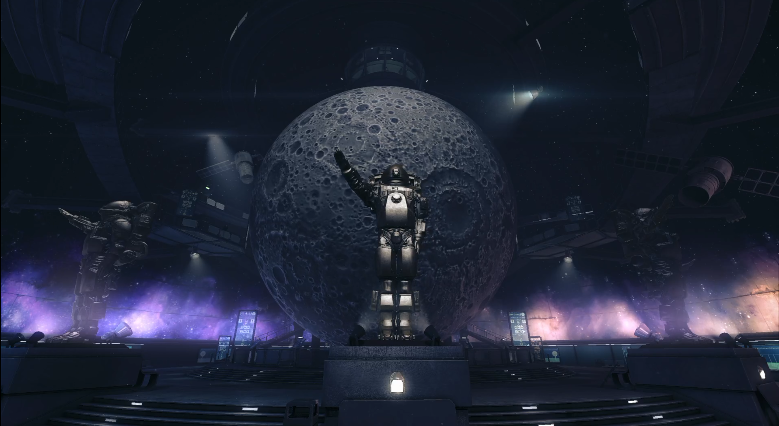
Throughout Wolfenstein, you’ll return to this feeling constantly. Every hallway can barely fit two abreast, sharing more in common with bunker fortifications than the corporate buildings they’re meant to be. Board rooms and office spaces are confined by windowless concrete barely eight feet tall, uniform furnishings, memos, and posters plastering every wall and desk across the entire game. Even the spaces meant to inspire awe—namely, the projection room in the London Nautica displaying a several-stories tall projection of the moon ringed by museum exhibits—is encased by concrete. There is no wonder in this space, no telescope or window to look up to the stars in awe; the room is designed to make us feel one thing: even in this building in the middle of London, the Nazis have captured the moon. It is held within their iron grasp simply by design.
If there's one thing I'd like you to carry with you through the rest of this collection, it's that power rarely appears as power. To be felt, to be tangible, it must be given form. The abstract beliefs of manifestos are made real not by a triumph of the will, but with pencil lines on a blueprint, a typeface chosen for a letterhead, a city plan, or a memo.
The pieces that follow examine those forms from different angles. Through architecture, typography, game design, and the worlds we inhabit, they all return to the same question:
How does design give power form?
Explore more of the collection:
 Phil Bothun
 70% Complete